Project GO

Urban Heat Islands

Lesson Plan Two: Identifying Urban Heat Islands

Overview: Students are introduced to two geographers who study urban heat islands and work with cities across the country to help reduce the impact of urban heat on residents—especially the young, the old, and those with lower socioeconomic status. Then students will analyze GIS maps to examine for themselves how urban heat can impact people’s lives.

Estimated Time: 100 minutes

Materials:
Worksheet 1: Studying Urban Heat Islands
Worksheet 2: Interpreting Urban Heat Island Maps
Worksheet 3: Making Comparisons
Video: Studying Urban Heat Islands (5:50)
Map: Land Surface Temperature Modeling
Map: Median Household Income Modeling
Map: Extreme Heat Vulnerability Index Modeling
Map: Map of Marion County
Computer and internet access
Overhead projector and/or document
Ruler

Learning Objectives: After completing the lesson, students will be able to:

  1. Use a three-step procedure to interpret maps
  2. Systematically compare maps
  3. Explain how land surface temperature and socio-economic level affect heat vulnerability

Vocabulary:

Census Block Group: A statistical division of a census tract, used to present data, generally containing 600- 3,000 people.

Census Tracts: Small, relatively permanent statistical subdivisions of a county or equivalent entity that provide a stable set of geographic units for the presentation of statistical data. Census tracts generally have a population size between 1,200 and 8,000 people, with an optimum size of 4,000 people.

Median Household Income: The amount which divides the income distribution into two equal groups, half having income above that amount, and half having income below that amount.

Vulnerability: Open to physical harm or damage.

GIS Tools and Functions:

  • Use GIS paper maps to read a map (symbols, scale, direction)
  • Use GIS maps to interpret patterns

Additional Resources:

Eric Klinenberg, Heat Wave: A Social Autopsy of Disaster in Chicago. University of Chicago Press, 2002. This book focuses on the aftermath of the Chicago heat wave of 1995, mentioned in the video for this lesson.

Opening the lesson:

“You are now about to be introduced to two geographersGEOGRAPHY: Ask your students if they know what a geographer is. Responses will vary, but should include that they study the earth (physical), humans (cultural), and the interaction between humans and the environment. who study urban heat islands using geospatial technologiesAsk students to identify what geospatial technology is. Responses should include Geographic Information Systems (GIS), Global Positing System (GPS) and Remote Sensing (RS). and use what they learn to help cities deal with the effects of urban heat.”

  1. Distribute a copy of the Studying Urban Heat Islands handout to each student.
  2. ShowMake sure to view the video before showing to students to familiarize yourself with the content and to ensure the video works. the Studying Urban Heat Islands video. Ask students to find and record answers to the questions contained in the handout, as they watch the video.
  3. After showing the video, give students an opportunity to comment, express opinions, or ask questions about what they have seen.
  4. Then, have students work in small groups of three or four to discuss their answers to the questions on the handout. Encourage students to modify their answers to the questions, based on their small group discussion.
  5. Then have students share what they have learned with the class. Again, encourage students to modify their answers based on the class discussion.

Developing the Lesson:

  1. Indicate to students that they are now going to use three maps generated by the two geographers they just saw in the video to examine for themselves how urban heat impacts people’s lives.
  2. Distribute a copy of the Interpreting Urban Heat Island Maps handout to each student.
  3. As a classIf you have completed the Precision Agriculture Module prior to starting this module, you can have your students work in groups to complete the handout. If you have not, this is an opportunity to model for the class how to interpret a map. interpret the Land Surface Temperature (LST) Map that appears in the handout. Follow the three-step map interpretation procedure outlined in the handout.
  4. At the front of the class, you should have the map and worksheet projected on an overhead projector and /or a document cameraAs you are modeling how to read a map you will need to talk about the steps you are doing in order to answer the questions. Allow students time to think about the answer before providing it to them. But because you are modeling it, they may or may not answer out loud.. As you go through the worksheet, write answers in the correct spaces, so that students know how to complete the worksheet.
  5. Begin by reading the worksheet from the top. “Important information about urban heat islands can be obtained from maps. Before the information on a map can be described and analyzed, it is necessary to have a clear understanding of what the map is about. This is the first step in obtaining information from a map.

    “Question One, what is the map about? This involves previewing the map. So we are going to look at these five items: title, symbols, map scale, compass direction, and footnotes, and identify them in a way to understand what the map is about.

    “What is the title of this map?”

    “Titles are usually found at the top of a map (point to an example in the classroom if you have a map hanging). However, this map does not have a title at the top. What else do we know about titles? They are usually bold and larger than the rest of the text. Where on this map do I find that type of textMake sure to provide enough wait time to allow students a chance to answer.?

    This text, Land Surface Temperature (LST) Modeling, is a different color, uppercased and larger than the text below, so this is the title.

    “Based upon this title, what is this map about?”

    “The title suggests that this map is about the temperature of the surface of the land.

    “The next step is decoding the symbols. In order to decode symbols, I must look at the legend or key.

    “Where is the legend on this map? And what does it mean?

    “The section on the right looks like a legend. The legend shows land surface temperature measured in degrees Fahrenheit. The dark red is 87 degrees to 93 degrees; orange in 85 to 87 degrees; yellow represents 84 to 85 degrees; green is 83 to 84 degrees; light blue is 81 to 83 degrees; and dark blue represents 73-81 degrees. Notice how each color is represented by different rangesMATH: Students can calculate the range of degrees for each color using simple subtraction. Dark Red 6; Orange 2; Yellow 1; Green 1; Light Blue 2; Dark Blue 8 of temperature, also called intervalMATH: There are four types of measurement scales: nominal, ordinal, interval and ratio. data. The legend shows the data being classifiedGEOGRAPHY: If you already completed the Tornado Alley lessons, think back to tornado alley lesson 2 when you were changing the symbols for various attributes (average number of tornadoes, strong/violent tornadoes). Even though we didn’t do this for the tornado lesson, we did explore changing the classification of data by grouping the data into classes. There were natural breaks, equal interval, standard deviation, quantile, and manual breaks. Of those, how do you think the data for Land Surface Temperature map is classified?. The attribute of temperature is being classified into 6 classes.

    “So what does this mean? The dark red represents hot land surface temperatures and the dark blue represents the coolest land surface temperatures.

    “Next, we are going to check the map scaleMake sure to model on the overhead projector how to figure out the scale.. Everybody take out your rulerMATH: Using rulers and measurement is very important. Use the graphic below to help with the measurement because it does not use round clean numbers. 1

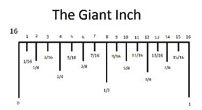
    1 http://nickcornwell.weebly.com/how-to-read-a-ruler.html
    and let’s figure out the relationship between the distances on the map to the actual distance on the ground for this map.

    1 inch is equal to about 3.4 miles

    1 inch is equal to about 5.6 kilometers

    8 miles is equal to 2 916 inches

    10 kilometers is equal to 1 1316 inches

    “Let’s expand on this and measure the areaMATH: Area = Length x width of this map. In order to get the area of the map we need to figure out the length and the width and then multiply the two. For this map, we are going to leave out the little sliver of area in the top right section of the map. And make sure that when we are measuring the width and length we put our ruler through the middle of the map.

    • Width = 5 ¾ inches
      1 inch=3.4 miles= 19.55 or 19 ½ miles


      5 ¾ inches? miles
    • Length = 5 1316MATH: You will need to know that 13/16 equals 0.8125 inches
      1 inch=3.4 inches= 19.7625 or 19 ¾ miles


      5 1316 inches? miles
    • Area of the map = 19.55 miles X 19.7625 miles = 386.36 square miles

    “Do our calculations seem correct? How can we test that based upon given informationMATH: We know that 8 miles is equal to about 2.5 inches. So if we double 8 to give us 16 miles we would double 2.5 inches which gives us 5 inches. 16 miles is close enough to 19 miles and both the width and length are over 5 inches, so we can assume our calculations are correct.. Would you say our map is a small-scale map or a large-scale mapGEOGRAPHY: The map is a large scale map because it shows a small area in greater detail.?

    “Next, we are going to use the compass to find north. This way when you are describing locations and features you can use cardinal directions* The cardinal directions are North, South, East and West. Knowing these and being aware of which way is north is important when you are going from place A to place B and are following a set of directions. to describe spatial relationships* Describing spatial relationships is important when talking about an area and features. It gives greater detail than simply saying left or right. Descriptive words include: above, along, apart, around, behind, below, beside, bottom, buffer, center, clustered, connected, distributed, down, far, inside, intersect, isolated, next, outside, over, parallel, patterned, peripheral, random tangent, top, towards, under, up. For example, north of the hottest cluster are low temperature clusters.

    “Lastly, let’s look to see if there are any footnotes. Footnotes contain the source of information, or in other words, where the data came from. Here we can see it is from Marion County Census BlockgroupsGEOGRAPHY: Blockgroups are divisions of census tracts that contain between 600 and 3,000 people. A census tract is a small, relatively permanent statistical subdivisions of a county or equivalent entity that provide a stable set of geographic units for the presentation of statistical data. Census tracts generally have a population size between 1,200 and 8,000 people, with an optimum size of 4,000 people. from 2010. This data is 6 years old.

    “Let’s move on to Question Two. What does the map say? The second step in obtaining information from a map involves asking and answering questions about how things are arranged on the map.

    “Ask and answer ‘fact finder’ questions. Some questions are asked to find facts that are important. Answering ‘fact finders’ supplies you with basic information about the features on the map.

    “Ask and answer ‘pattern finder’ questions. Pattern finders ask how things are arranged over the map. A basic distinction is made among clustered, random, and uniform arrangementsUniform (top) Random (middle) Clustered (bottom)2

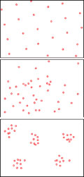
    2 https://en.wikipedia.org/wiki/Species_distribution
    . With clustered arrangements, objects are located close together. With uniform arrangement, objects are evenly spread over an area. With random arrangements, there is no pattern to how objects are arranged. Answering pattern finders supplies you with information about the arrangement of features on the map.

    “We are going to examine the LST map and determine how the features on the map are arranged by answering the following questions.

    “Are there areas of high land surface temperature shown on the map of Marion County?

    “Is the arrangement of areas experiencing high land surface temperatures clustered, random, or uniform? What makes you say so?

    “Is the arrangement of areas experiencing low land surface temperatures clustered, random or uniform? What makes you say so?

    “Where on the map are the areas of high land surface temperature clustered?”

    “Question Three asks what the map means. We need to take the information we gathered in Questions One and Two, analyze it and combine it into a brief, well- organized summary. This summary should consist of five to six sentences that draw together the information obtained from the map.

    Have students write a short paragraph summarizing the information obtained from the LST map. Have some of the students share their responses to the class.

  6. Have students work in groupsWalk around the class to make sure students are on-task and help them if they seem to have trouble. of two or three, to complete Part 2 of the Interpreting Urban Heat Island Maps worksheet and answer questions about the Median Household Income (MHI) Modeling map. Students will follow the same three-step process.
  7. Once students finish their work on the MHI map, have them share their responses with the class. Encourage students to modify their interpretations of the MHI map, based on their classroom discussion.
  8. Tell students that Part 3 of Interpreting Urban Heat Island Maps will be homework.
  1. Distribute a copy of the Making Comparisons handout to each student. Have students work in their small groups to compare the patterns on the LST and the MHI maps, using the two-step procedure that appears in the Comparing Maps handout.
  2. When the small groups have completed their work on comparing the two maps, have students share what they learned about the maps, as a class. Encourage students to modify their comparisons of the maps, based on their classroom discussion.

Marion County Map Activity

  1. Indicate to students that they are going to examine some other maps of Marion County, Indiana to get some further insights into urban heat islands. Using a computer, go to Google Maps and search for Marion County, IN. Project the image onto a screen. Zoom in so that the county fills the screen.
  2. Map
  3. Ask students, “Does this map represent the same area as the maps we were working with in this lesson? What makes you say so?
  4. Ask students to examine the Google map of Marion County and identify features that could affect the land surface temperature variations that they observed on the maps earlier in the lesson? (Students might identify the following features: two lakes (one on the west side and one on the Northeast corner of the county), the White River flowing through the county from the Northeast to the Southwest, the City of Indianapolis in the center of the county, and less urban concentrations around the edges of the county.)
  5. Then ask students how these features are reflected in patterns seen on the LST and EHVI maps. (Students might respond that in the center of the county, where Indianapolis is located, there is a large cluster of high land surface temperatures. As one moves away from the city center, the land surface temperatures decrease, areas along the river seem to have lower surface temperatures outside of Indianapolis, and if we look at the two lakes in the county, we see that those align with the lowest land surface temperatures.)
  6. Indicate to students that the next map they are going to see will show the actual landscape of Marion County. This map can also be compared with the maps that they have been working with. Click on Satellite in the bottom left corner of the Marion County map.
  7. Marion County Map
  8. Ask students what they think each of the colors on the map represents. (They should respond that the gray represents built up areas, while the green represents areas covered with vegetation.)
  9. Then have students compare what they see on this map with the LST and EHVI maps. Do they see a correspondence between gray on the landscape map and red on the temperature maps? Do they see a correspondence between the green on the landscape map and blue on the temperature maps? Ask them what conclusions they can draw from these comparisons. (Students should respond that the high surface temperatures are where the concrete is, and the cooler temperatures are where the vegetation cover is located.)

Concluding the Lesson:

  1. For homework, have students interpret the Extreme Heat Vulnerability Index (EHVI) Map, completing the rest of Interpreting Urban Heat Island Maps handout. Remind students that extreme heat vulnerability was featured in the video they saw in this lesson. One of the questions in the Handout associated with the video focused on extreme heat vulnerability. Indicate that they will be sharing their findings in the next class period.
  2. The next day in class, ask students to share what they learned from interpreting the EHVI Map.
  3. Have students reassemble in their original small groups of two or three. Ask each group to determine how the “high heat risk” areas that they identified from comparing the LST and MHI Maps, compare to the most vulnerable areas identified on the EHVI Map. Have some of the student groups share their findings.
  1. Ask students to try to explain how income and surface temperature contribute to heat vulnerability. (Answers will vary.)
  2. As a class have students identify a list of characteristics of an urban heat island.

Lesson Plan One: What are Urban Heat Islands?

Lesson Plan Three: Heat Sensitivity